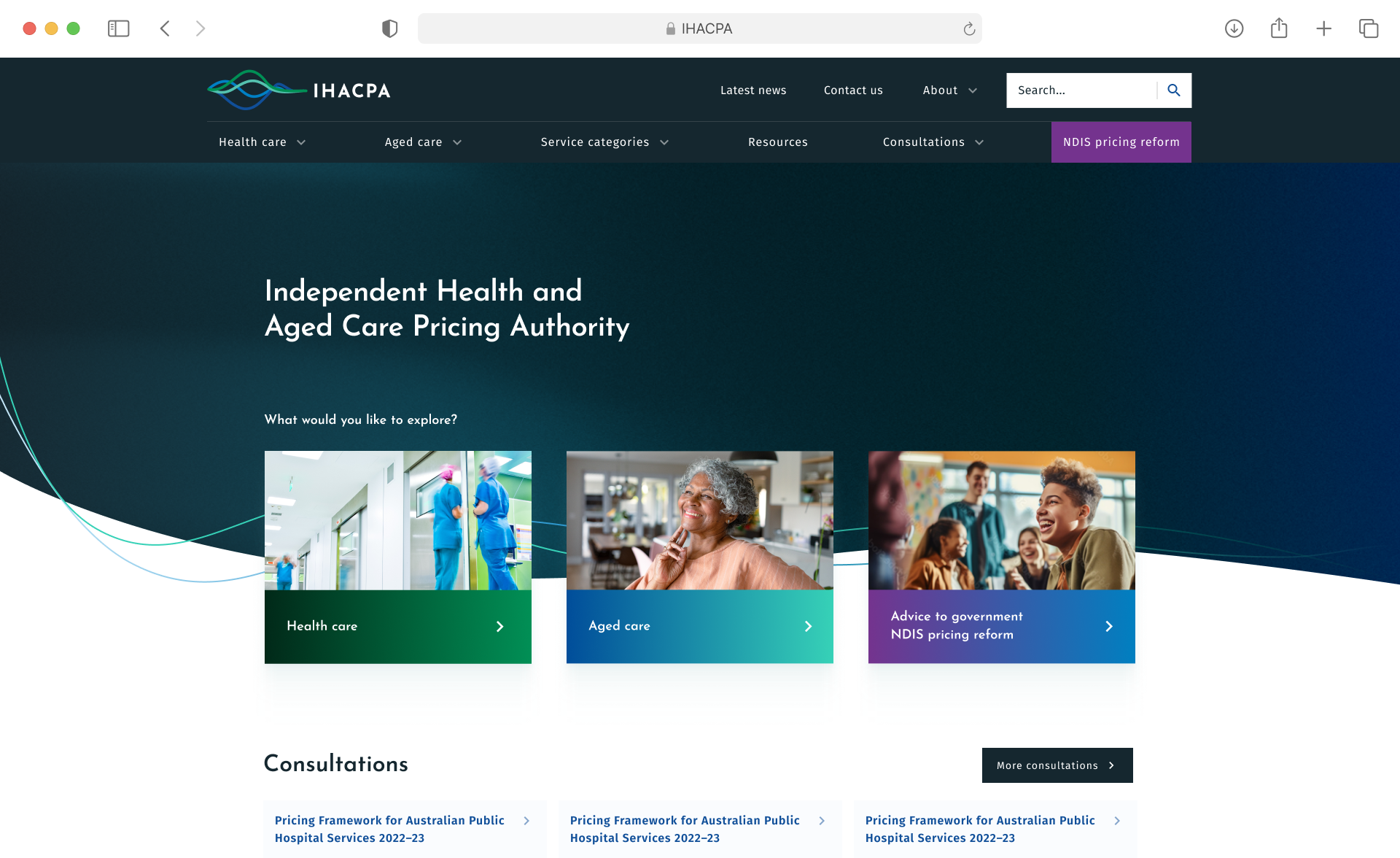
Clearer industry sector pathways
Home
How It Works
Our Talent

glencable.com


glencable.com
Work
Career
awards
about me
Contact
Let’s Chat

Brisbane, Australia
0430 604 553
cable.glen@gmail.com
Improving information visibility on a data heavy website
My Disciplines: Audience research, User testing, prototyping, UX/UI Design
The Problem
IHACPA provides transparent pricing systems across the health and aged care sectors. Their website serves as a central hub, housing a large volume of data used by industry professionals to source accurate and relevant information.
However, after gathering user feedback, IHACPA discovered that many visitors were becoming disoriented and struggling to find what they needed. Navigation pathways were unclear, and users often felt lost in their journey.
They approached us to help improve user pathways, reduce visual and informational noise, and make it easier for users to quickly locate the content they were seeking.
What I did first
IHACPA needed evidence-based enhancements and a clear roadmap to guide implementation efforts and maximise impact.
To start, I developed a detailed report outlining key UX issues related to findability on the existing site. I also recommended a series of tactical improvements to address these challenges.
In addition, I created a horizon roadmap to support IHACPA in gradually enhancing their digital experience.
This roadmap included prioritised UI, UX, and content initiatives — ranked using T-shirt sizing to help align effort with potential value.
The Result
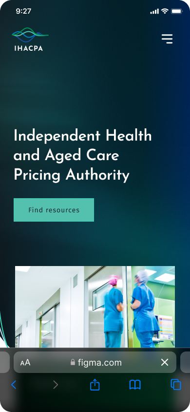
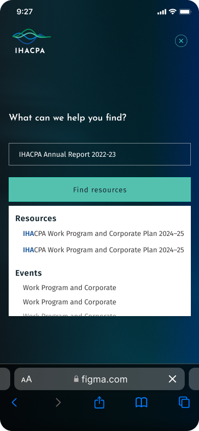
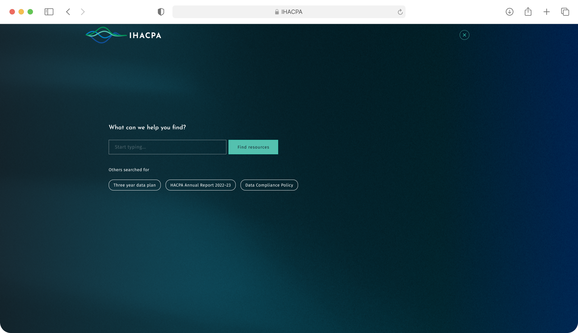
The initiatives implemented significantly improved the overall usability and clarity of the IHACPA website. By introducing clearer industry sector pathways, users could more intuitively navigate to relevant areas of the site without confusion or backtracking. Enhanced search capabilities and a more responsive search interaction empowered users to find specific content faster and with greater accuracy.
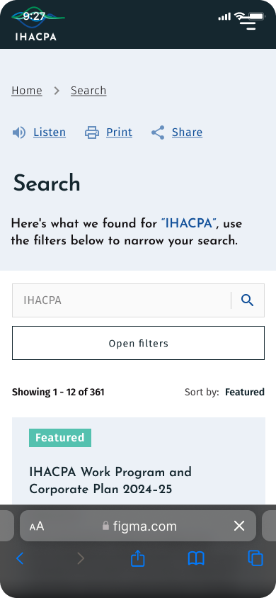
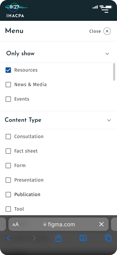
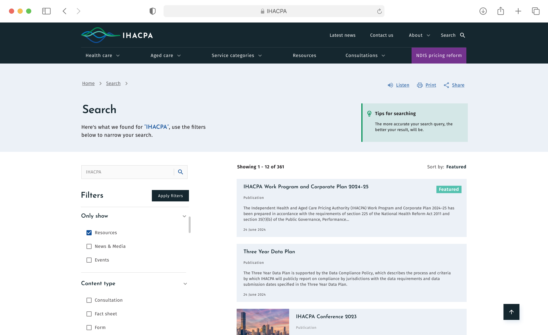
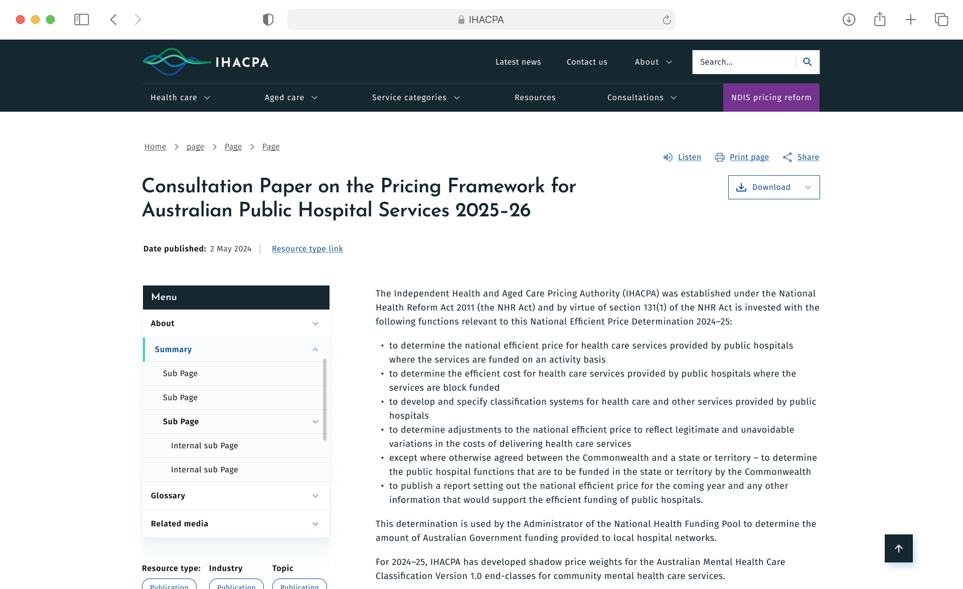
The addition of precise filtering facets and clearer messaging reduced cognitive load and guided users more effectively through complex datasets and publications. Refinements to the publication layout and improved information hierarchy also made dense content easier to scan and digest — resulting in higher engagement with key resources.
Collectively, these changes helped reduce user frustration, streamline content discovery, and deliver a more confident and purposeful user journey through IHACPA’s information-rich environment.
Visit website
More projects

More projects
Improving information visibility on a data heavy website
My Disciplines: Audience research, User testing, prototyping, UX/UI Design
The Problem
IHACPA provides transparent pricing systems across the health and aged care sectors. Their website serves as a central hub, housing a large volume of data used by industry professionals to source accurate and relevant information.
However, after gathering user feedback, IHACPA discovered that many visitors were becoming disoriented and struggling to find what they needed. Navigation pathways were unclear, and users often felt lost in their journey.
They approached us to help improve user pathways, reduce visual and informational noise, and make it easier for users to quickly locate the content they were seeking.
What I did first
IHACPA needed evidence-based enhancements and a clear roadmap to guide implementation efforts and maximise impact.
To start, I developed a detailed report outlining key UX issues related to findability on the existing site. I also recommended a series of tactical improvements to address these challenges.
In addition, I created a horizon roadmap to support IHACPA in gradually enhancing their digital experience.
This roadmap included prioritised UI, UX, and content initiatives — ranked using T-shirt sizing to help align effort with potential value.
The Result
The initiatives implemented significantly improved the overall usability and clarity of the IHACPA website. By introducing clearer industry sector pathways, users could more intuitively navigate to relevant areas of the site without confusion or backtracking. Enhanced search capabilities and a more responsive search interaction empowered users to find specific content faster and with greater accuracy.
The addition of precise filtering facets and clearer messaging reduced cognitive load and guided users more effectively through complex datasets and publications. Refinements to the publication layout and improved information hierarchy also made dense content easier to scan and digest — resulting in higher engagement with key resources.
Collectively, these changes helped reduce user frustration, streamline content discovery, and deliver a more confident and purposeful user journey through IHACPA’s information-rich environment.
Visit website

Brisbane, Australia
0430 604 553
cable.glen@gmail.com
Improved the search capabilities and interaction
Accurate filtering facets and clearer messaging
Improving publication layout and Information Hierarchy
Clearer industry sector pathways